
THE ASK:
Design a pamphlet and poster to showcase a famous designer’s career, along with an original logo for them. No big deal, just helping Paul Rand out with his branding!
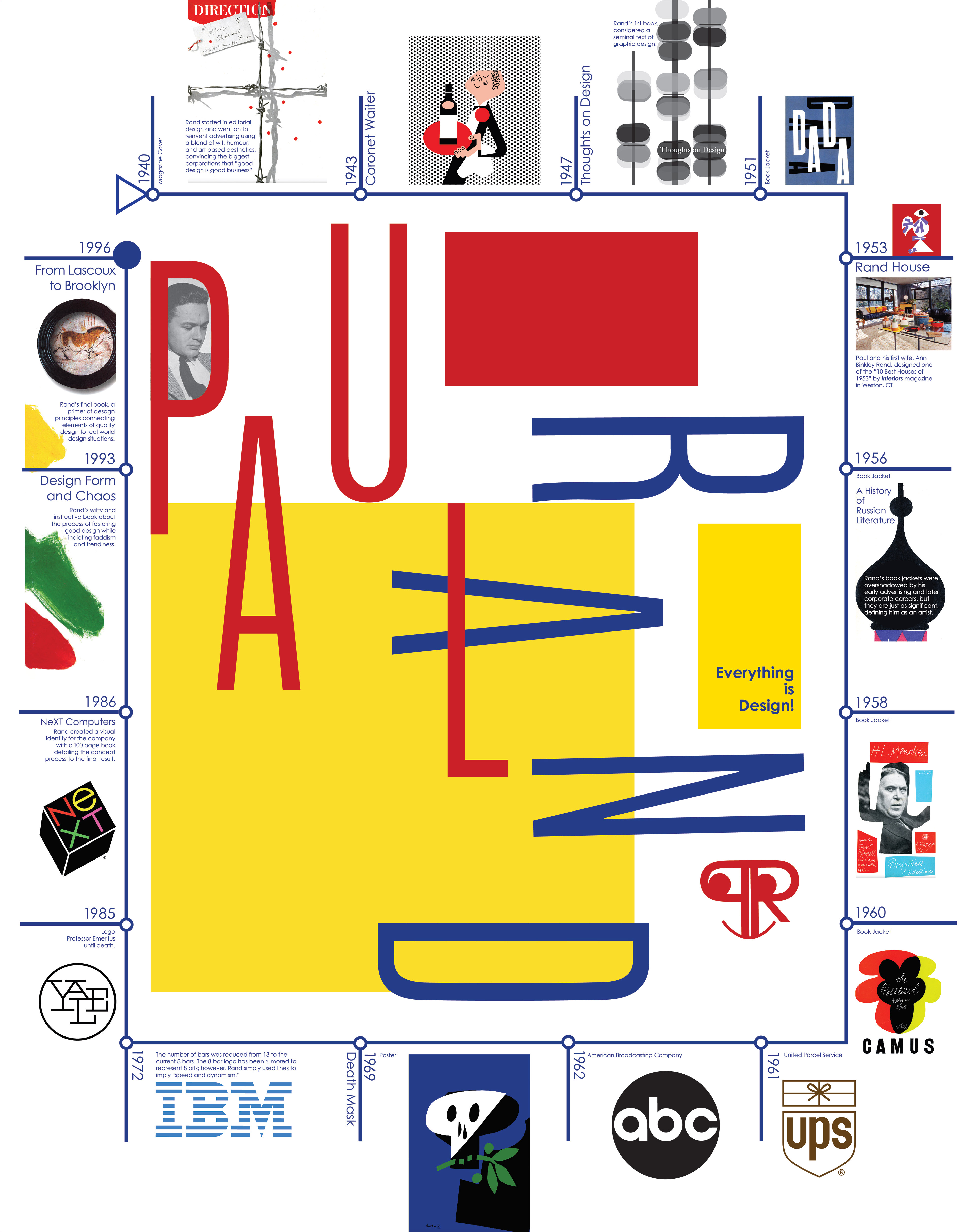
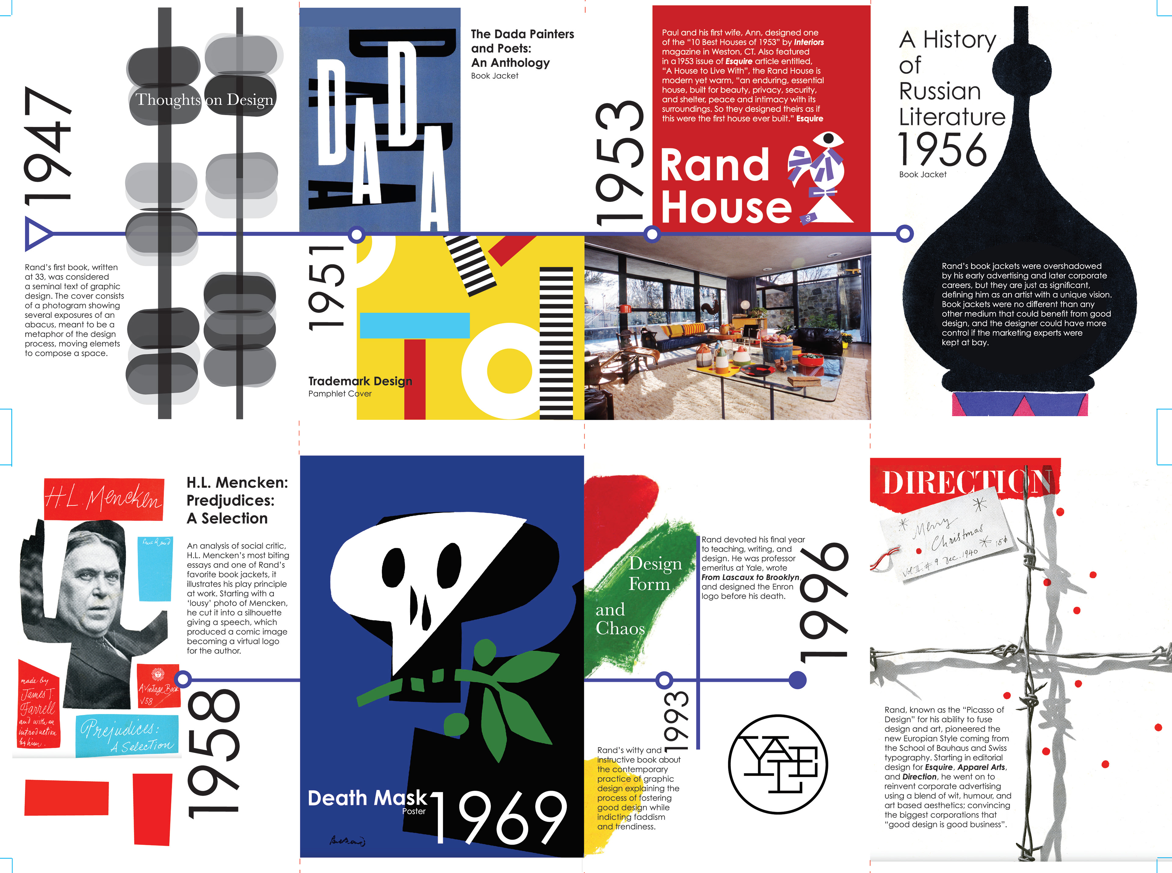
Using Rand’s bold primary colors without it feeling elementary or like a Mondrian knockoff was tricky. Keeping the timeline within the border helped keep the design clean and structured.
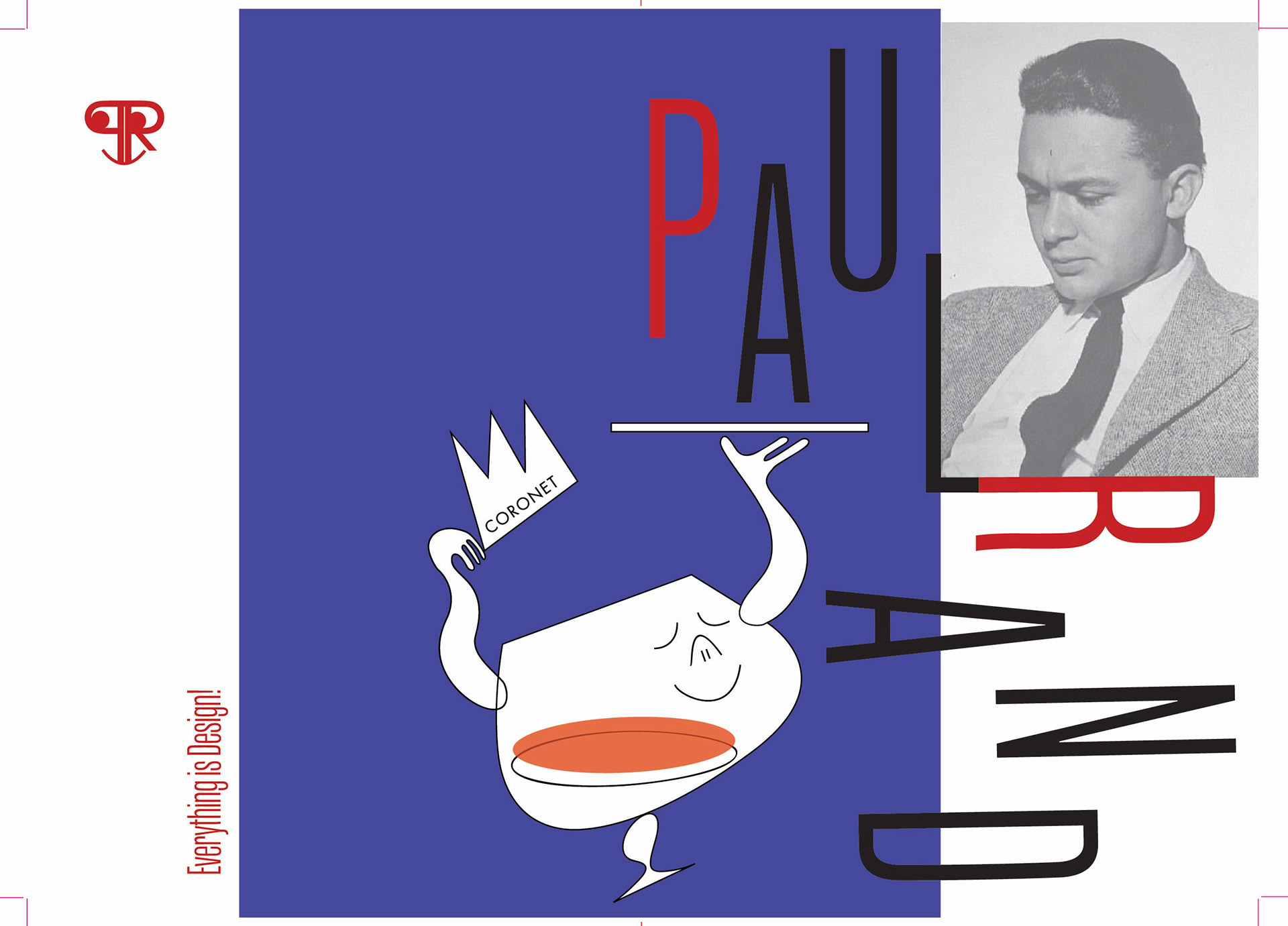
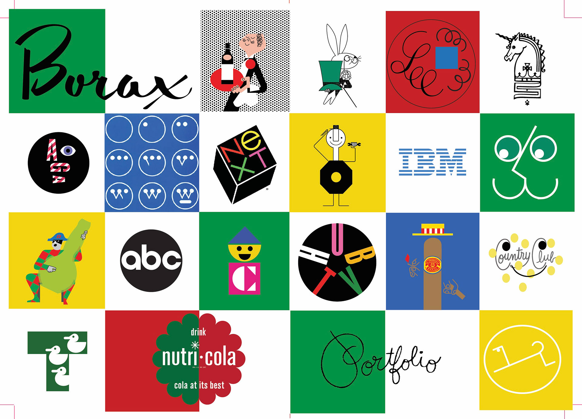
LOGOS


The second logo is a nod to Rand’s quirkier, more playful side. He had a reputation for being a curmudgeon, but try studying his work without cracking a smile.
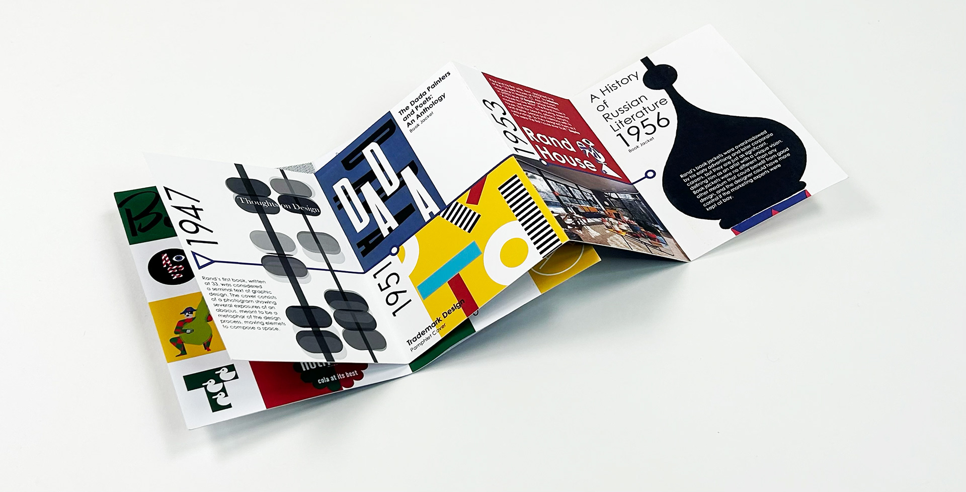
THE PAMPHLET
"Good design is good business"
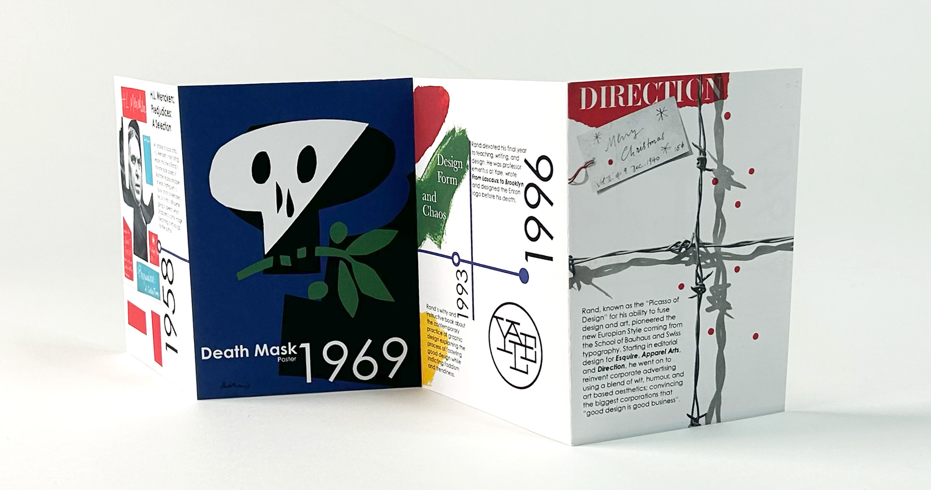
FRONT & BACK COVERS, INSIDE COVERS
The typical unfolding shot didn’t quite do it for me, so I decided to film the stop-motion video to capture the dynamic energy of Rand's work.
FOLD-OUT PAGE
FONTS:
Century Gothic Pro, Ateria STD Comp Regular