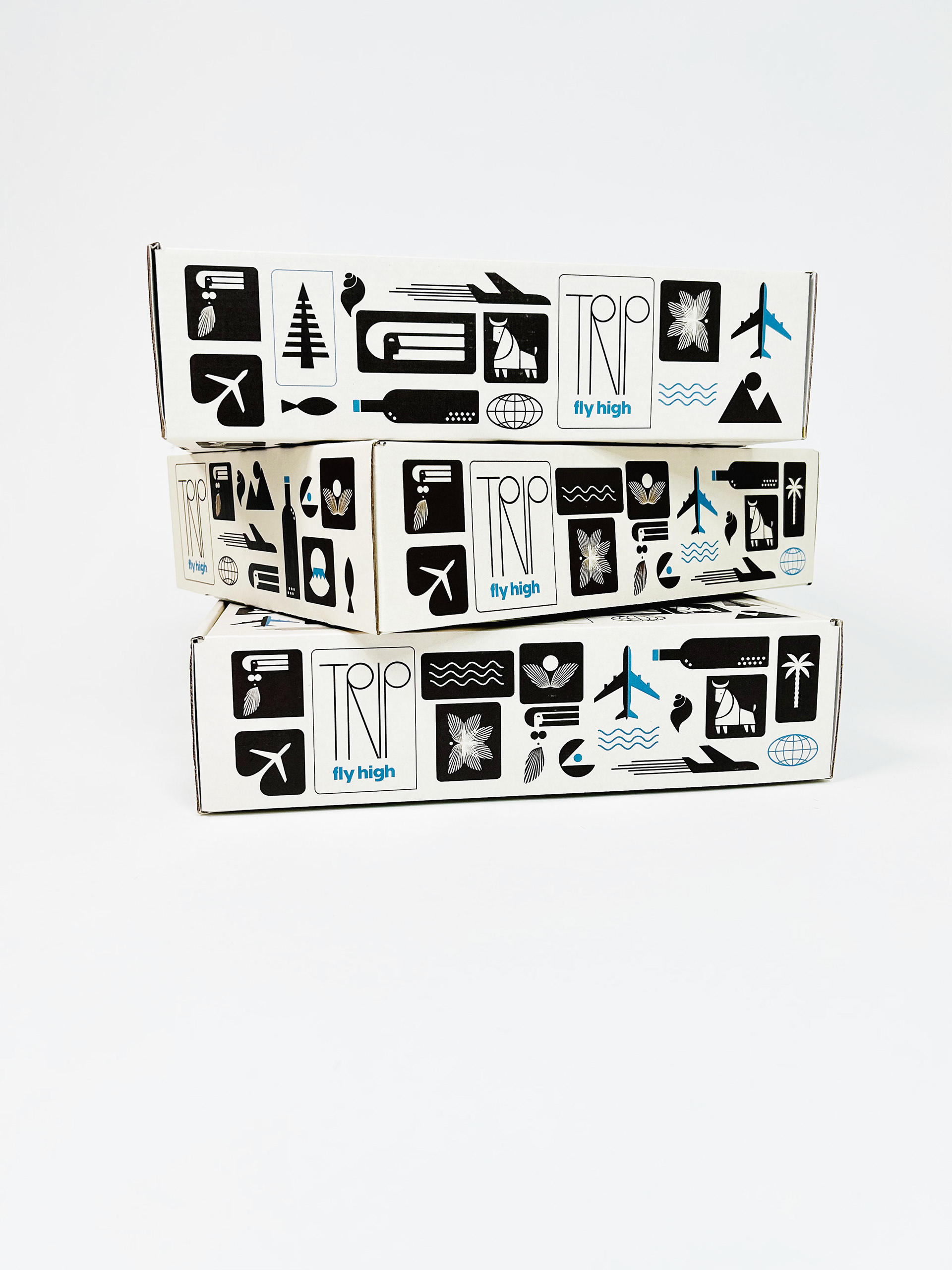
A great subscription box isn’t just packaging, it’s an experience, from the moment you open it to the last little surprise inside.
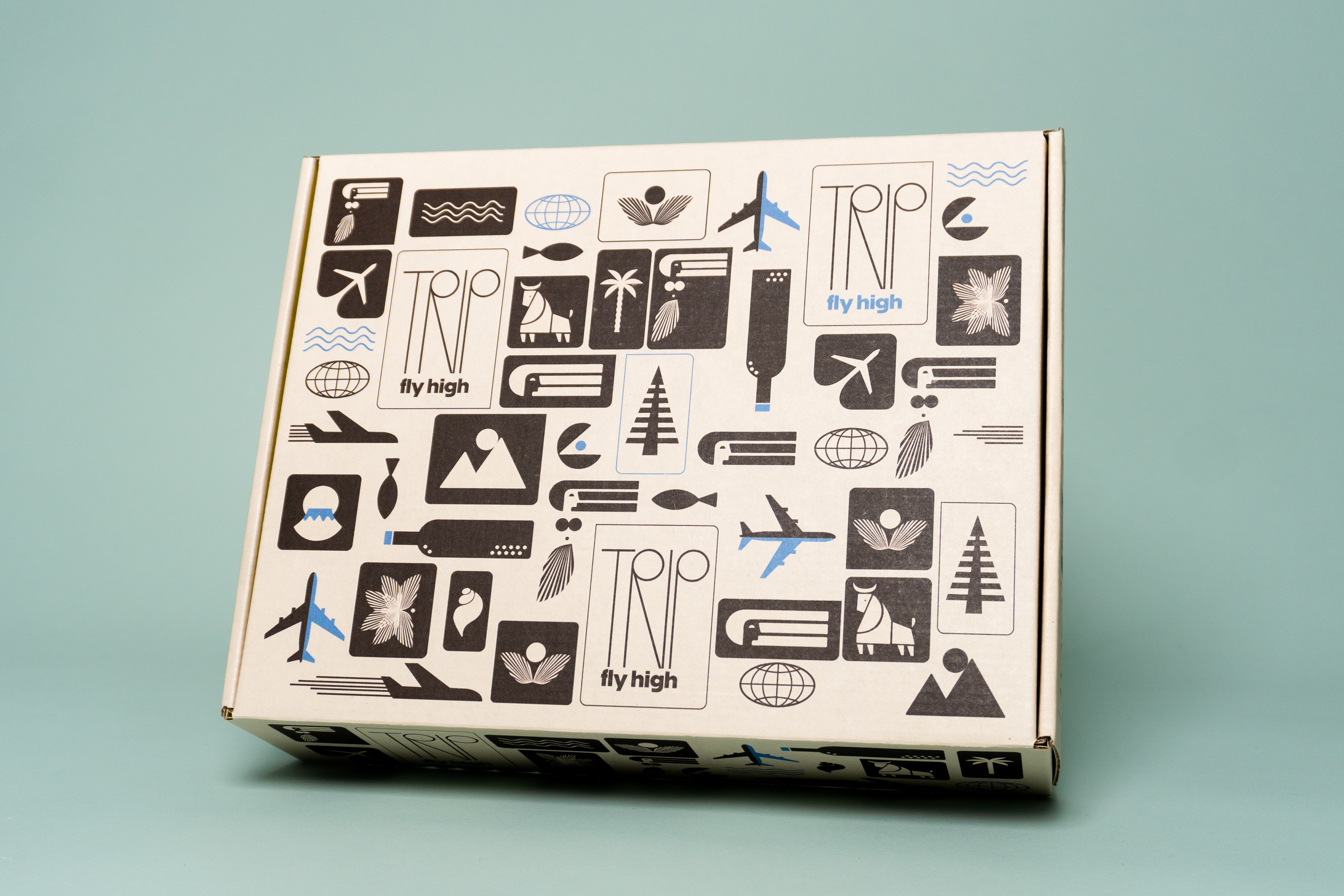
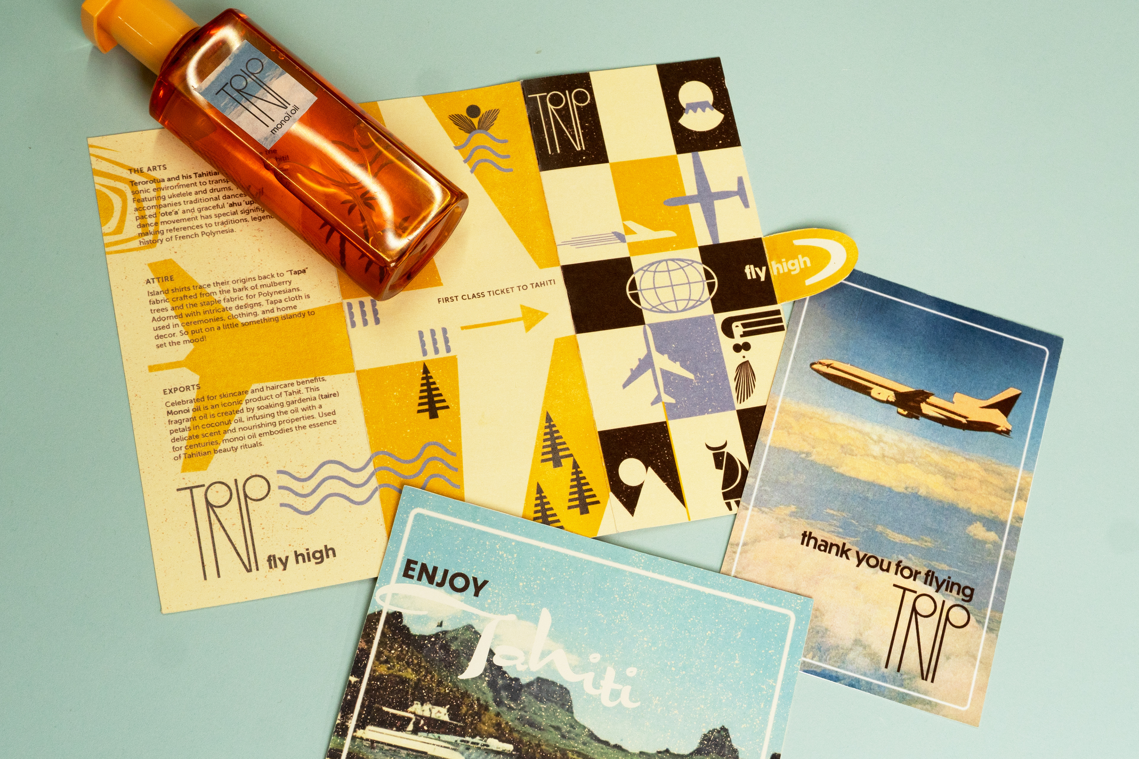
I set out to solve a common problem: most travel boxes feel generic, and I wanted Trip to be the next best thing to actually being there. So each box is a full-on sensory escape, packed with the sounds, scents, flavors, and textures of a new far-off destination.
DELIVERABLES:
Branded mailer box
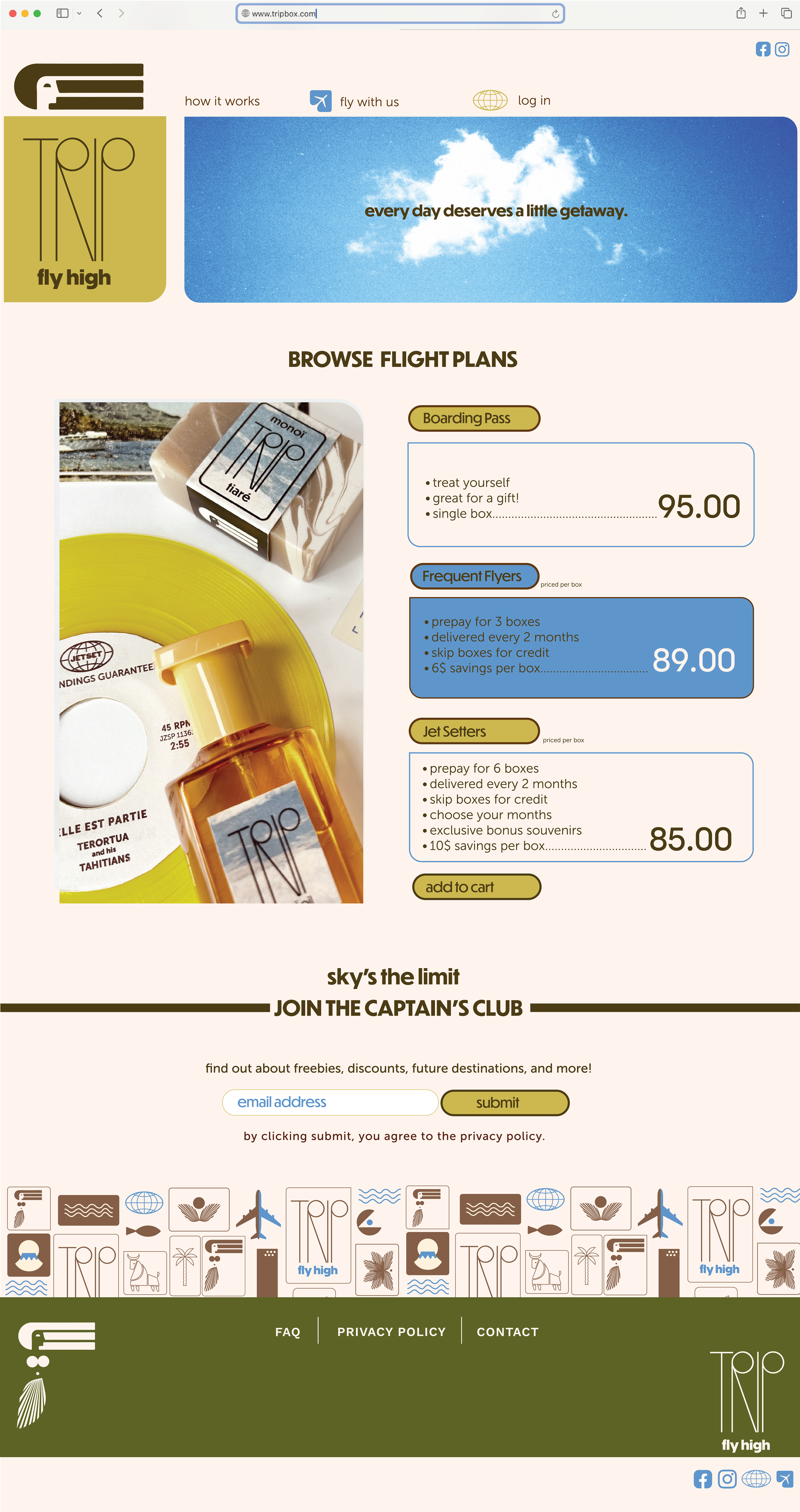
Landing page
Branded products
Subpage
Newsletter
FONTS:
Logo: Optima, Dunbar
Header: Dunbar
Body: Museo Sans 500
Numbers: All Round Gothic, medium
THE VIDEO
With local artisan collabs and sharp branding, unboxing feels like traveling in style. Trip is meant to be thoughtful, curated, and harken back to a time when air travel was part of the fun.
I created this video in my living room (sweating under rigged up lights) using Stop Motion Video and iMovie.
WEB & SOCIALS
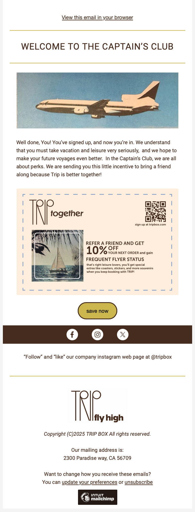
MAILCHIMP & SUBPAGE
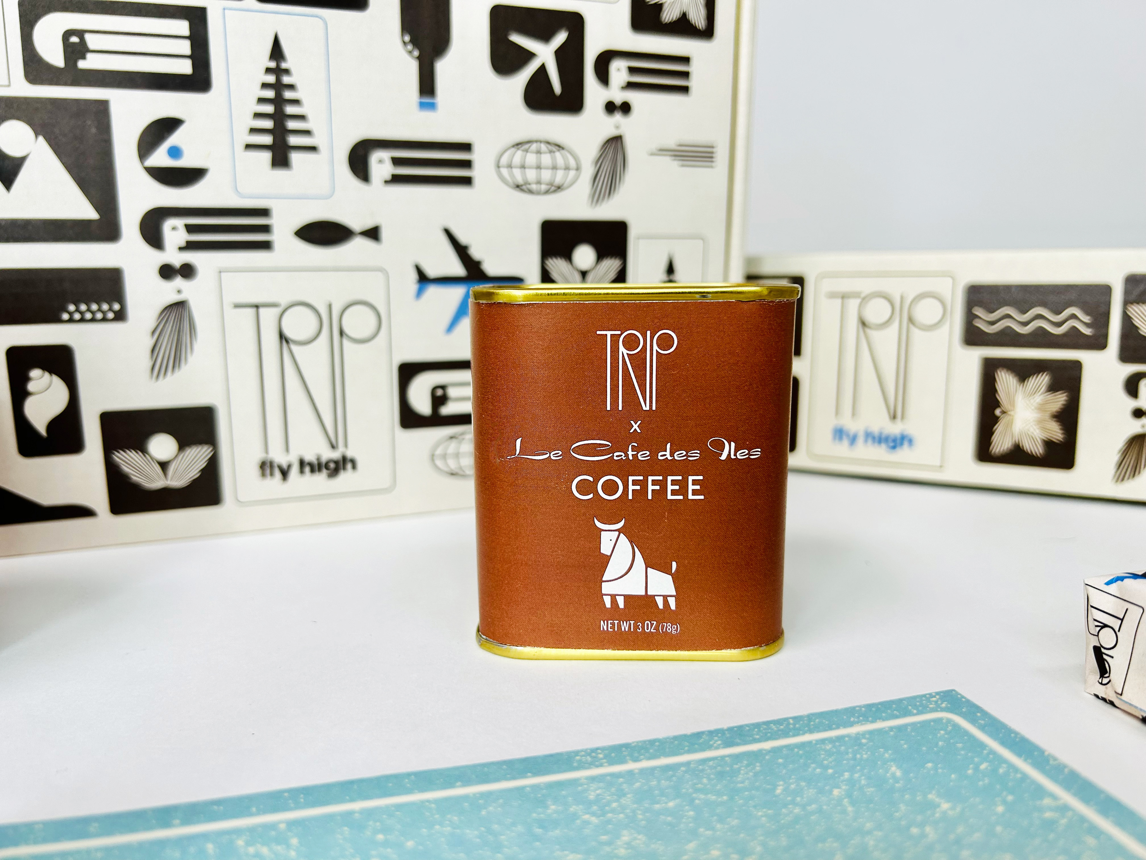
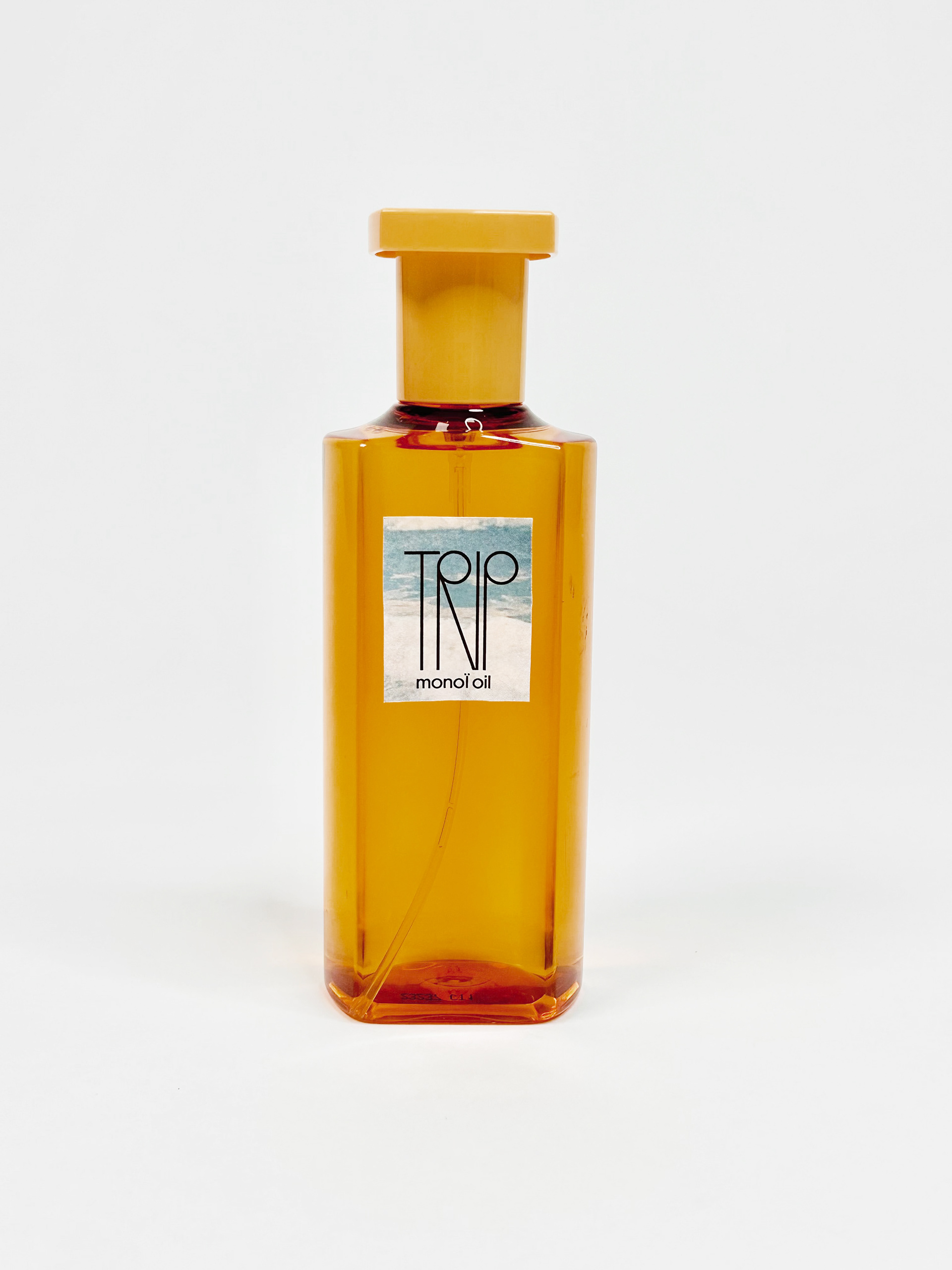
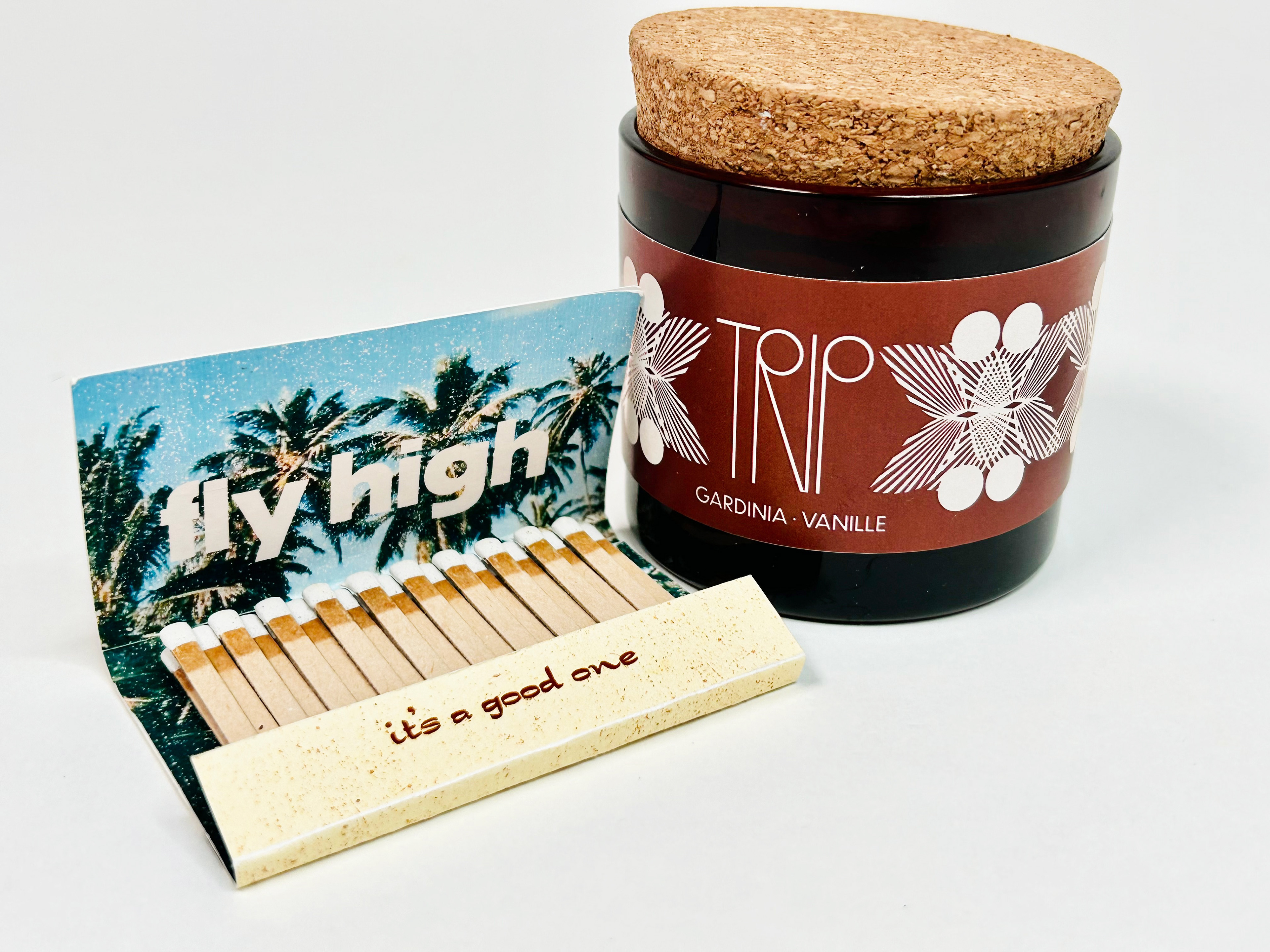
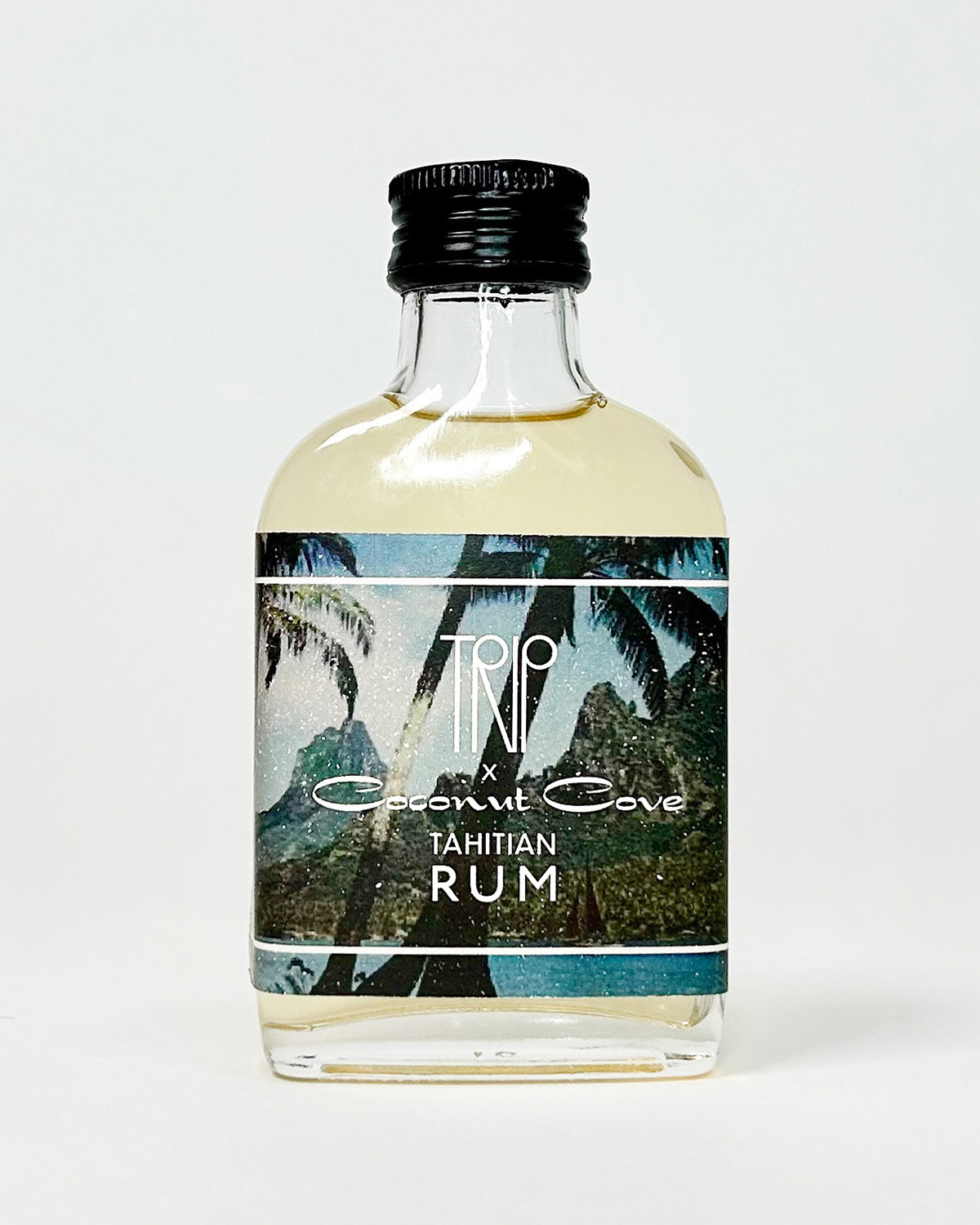
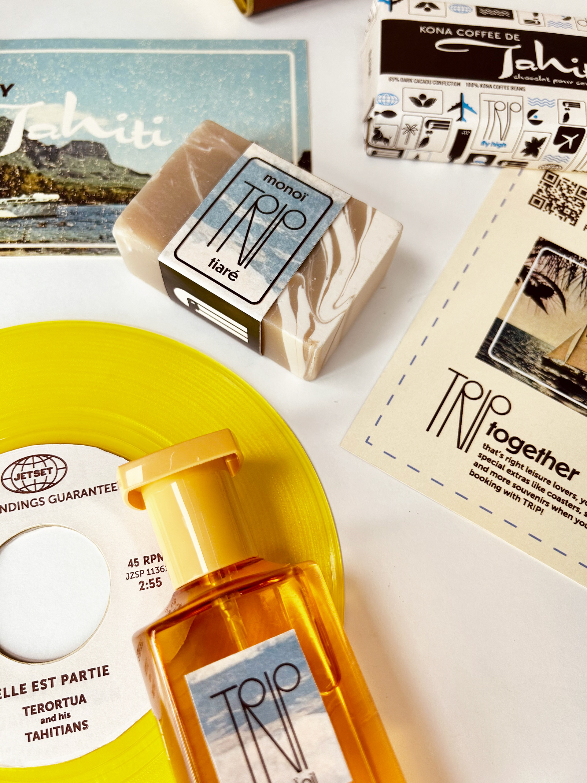
THE GOODS
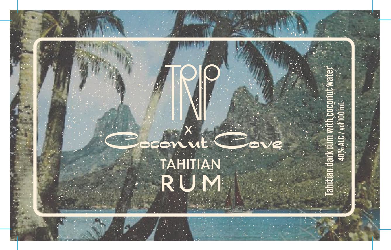
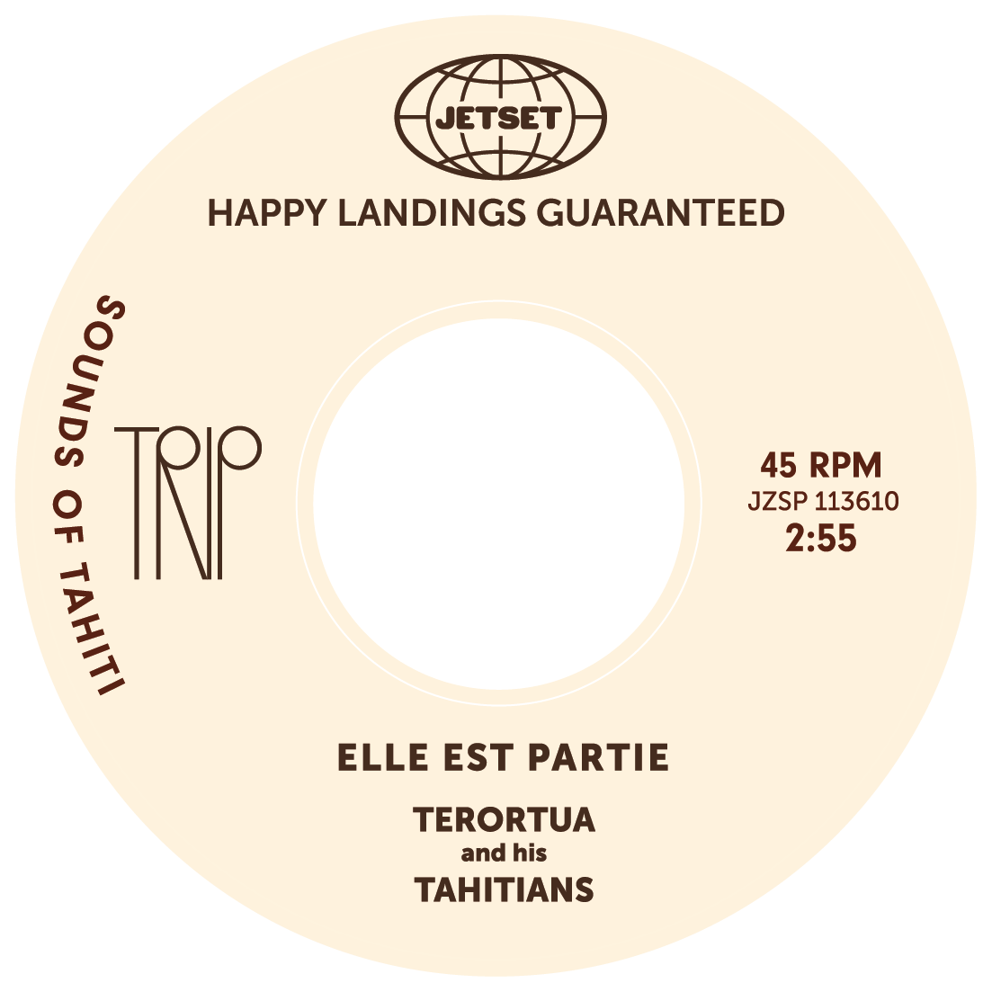
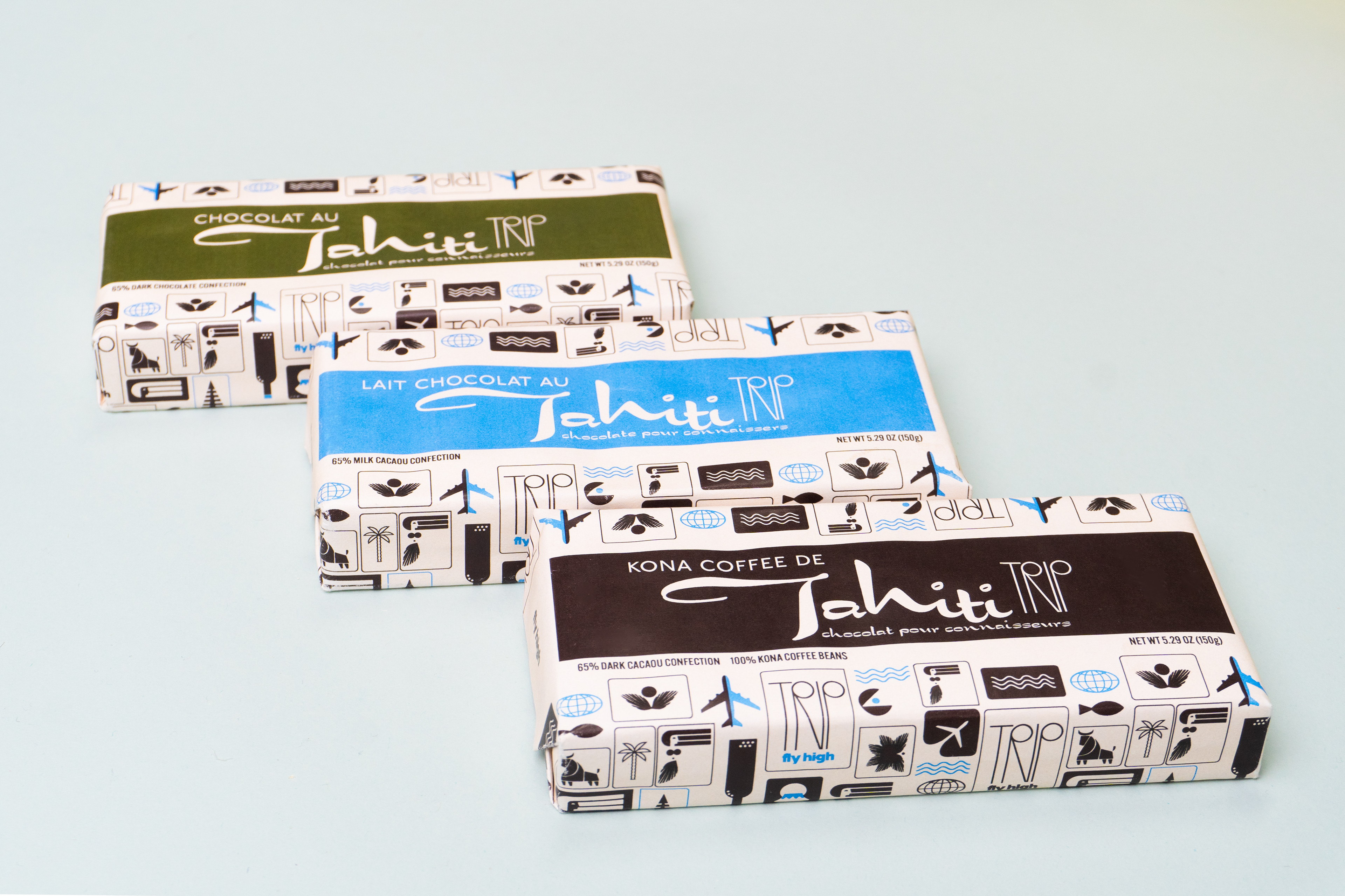
PRODUCTS DESIGNED:
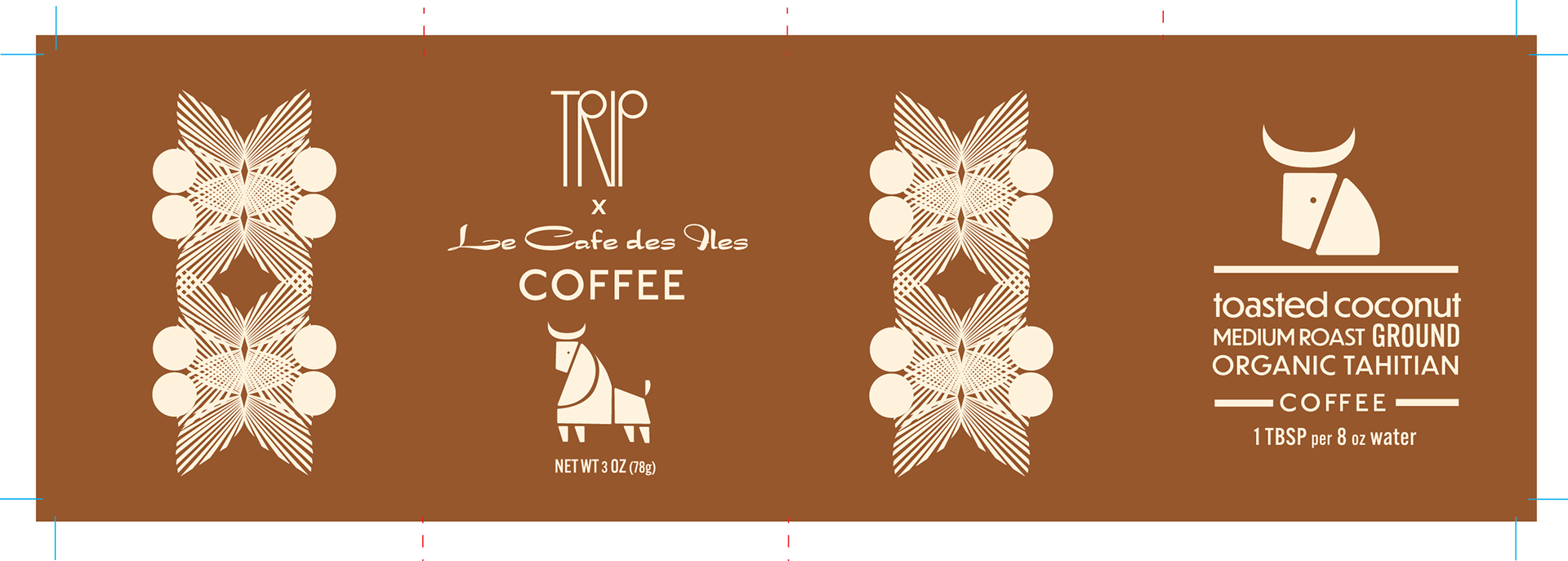
liquor label
retro travel brochure
matchbook
record sticker and sleeve
soap band
chocolate bar label
candle band
postcard coupons
recipe tag
pins
luxury oil label
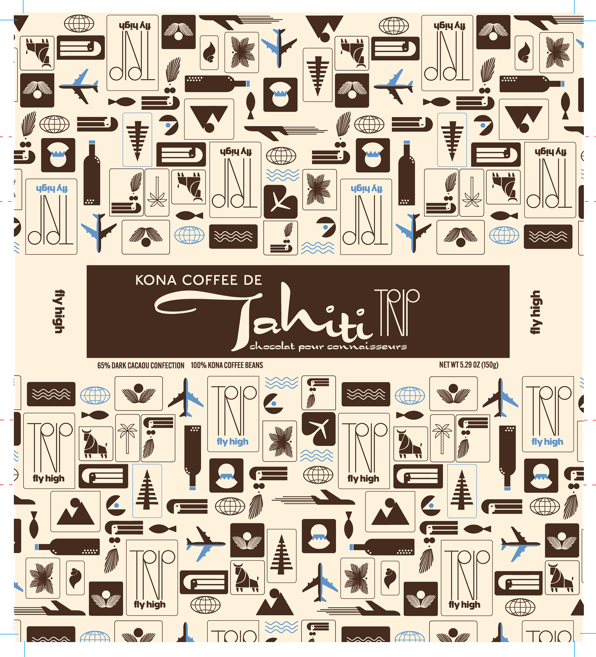
I illustrated a hula skirt, that I could use to create leaves, petals, and band patterns on the packaging and throughout the landing pages. We have cohesion!

PROJECT SCOPE:
Branding
Strategy
Social Strategy
Photography
Art Direction